/build/static/layout/Breadcrumb_cap_w.png

The New Package Knowledge Base

One of the key things about AppDeploy that everyone was vocal about the Package KB. I have to say I was very excited about the concept when it was first introduced several years ago and I’m happy to have given it some much needed enhancements as part of our move to ITNinja.

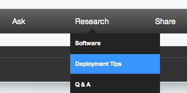
We’ve got a ton of software on the site (and it admittedly requires more work on our part in terms of cleaning and merging records), but realizing that, we have provided a filtered view of software on the site in the form of a “Deployment Tips” page (choose “Deployment Tips” under “Research” on the site menu). Rather than being limited to an alphabetical list, you can now type right into the box labeled “Explore Packages” to filter the list down to what you are looking for (or if you like the alphabetical approach you can scroll to you heart’s content).  As before the page highlights popular packages and recent updates, but new is the concept of following items—if you are following software, it gets listed on this page as well.

Side note: you can follow topics, users, software and specific versions of software throughout the site which feeds a personalized activity feed to help you focus on the content that interests you most!

It is the software pages of the site where the more impactful enhancements may be seen. You can now jump between other software by the same company and between different versions of the same software.  As before you can rate difficulty, add deployment tips in any of several categories and rate them. But now you can also comment on these individual tips as well. Further, we’ve added a “Deployment Tip Summary” as a place to more succinctly summarize what could be a long list of various tips into a simple here-is-what-you-really-want-to-know field. In some cases there may be dozens of tips saying similar things, this deployment tip summary is a community contributed summary of all the submitted tips aimed at getting reader's a quick answer up front (while of course still providing the full details for those that want to dig deeper).

Have a question about this software? How about a link to share? Want to write a how-to article or share your experiences about its deployment or use? Buttons for each are right on top and they will pass over the software tag in question so you don’t have to look up the software tag when posting. Then any of these things added on the site which share this software tag all show up on the same page. So all questions, links and blog posts are listed right on this one page.

As on AppDeploy, the sharing of tips should still be statements and not questions, but now asking questions and having them appear alongside the tips and other software information is possible (and easy to do).

Navigating software will get easier as we continue our work on merging and cleaning up our software database, but seeing past that I think the new functionality here will make the sharing and use of deployment tips a better experience for all.

Comments

  • Not fan of the dropdown menu box, it slows down navigation a lot, when working with multiple entries. - Erroneus 12 years ago
    • Thanks, it is a browser intensive control and initial research indicates some older browsers are having a tough time with it. We are seeing what can be done (or if necessary an alternative). - bkelly 12 years ago
  • While as a whole I think ITNinja was a huge upgrade over appdeploy i agree with erroneus and a few of my colleagues at work who really miss the alphabetical selection. it really isn’t a option to scroll around in such a small dropdown menu as it does slow down navigation quite a lot.

    Just my 2c ;) - Spef 12 years ago
    • I always thought my alphabetical navigation was a hack because I wasn't a good enough developer to offer better ;) Please vote the idea of alphabetical navigation of software with deployment tips at http://kace.uservoice.com/forums/139919-itninja/suggestions/2702216-bring-back-the-old-interface-for-package-kb - bkelly 12 years ago
  • I have to agree with the other guys, I find the drop down box un-useful it makes it hard to find the software titles when your not 100% on how someone else might have labeled it. - adam_emmaus 12 years ago
  • @bkelly: Can we have a notification0system much like Facebook or Google+, so that we know who`s been commenting on our post or posts we have been following. It`s not too much too ask right? :) - akki 12 years ago
    • I agree. It would be nice to be notified when someone posts a solution to your question. - ohiosoundguy 12 years ago
    • The Activity feed does that, but needs improvements: http://www.itninja.com/profile#activity-feed - Erroneus 12 years ago
      • Yes i know that buddy....but i was kind of suggesting what @ohiosoundguy said!! - akki 12 years ago
    • Nothing is too much to ask ;) We certainly don't pretend to have thought of everything and this is a good idea. Right now you can see who has been commenting on your posts in your activity feed (click "activity" at the top of the page when logged in) but an email notification, likely a digest feature has been suggested and is planned but not getting a lot of attention, please vote it up! https://kace.uservoice.com/forums/139919-itninja/suggestions/2607522-email-alerting - bkelly 12 years ago
      • Nice to hear Bob. I love the direction the site is moving. - ohiosoundguy 12 years ago
  • I really like the new site. - korean 12 years ago
  • I entered a deployment tip and it filtered out all the necessary syntax leaving the post inaccurate and less than helpful. - jriekse5555 12 years ago
    • We are aware of this issue and are working on a solution now - bkelly 12 years ago
  • Hey guys! I was a HUGE fan of Appdeploy and went to this site religiously! Unfortunately, I cannot say the same with ITNinja!!! The site is extremely slow and I cannot find anything! Nothing on old apps and nothing on new apps! Now, since Appdeploy has been switched, I got nothing! Not to happy with this site!! Two thumbs down! (Should have at lease imported all of the old Appdeploy stuff! - Ercle 12 years ago
  • Ok, will have to mellow down my previous comment! I read the part about the “Explore Packages†in the paragraphs above and finally found the applications! As jriekse5555 mentioned, I think that when the information was ported onto the new site, some information might have been filtered. there are alot of blank spaces, special characters which makes it very hard to sort through. Just look in this paragraph, I cannot even use double quotes!?!? - Ercle 12 years ago
  • This is awful!! Where has the "explore packages" box gone? - zzpack 12 years ago
  • Agree with the rest that this new navigation is awful! I loved the old site much better and faster navigation. - barryliu 12 years ago
  • Another vote for the alphabetical list; if it isn't broke ... - VanSant 12 years ago
  • This area needs a re-design IMO. It is way too tedious to search for the app, which could come up with tons of hits, and they are not sorted by date(ie Flash). And this method of browsing through pages of items listed alphabetically is very time consuming. - Timanator 12 years ago
  • Had a quick look, i like it (: - rileyz 12 years ago
This post is locked
 
This website uses cookies. By continuing to use this site and/or clicking the "Accept" button you are providing consent Quest Software and its affiliates do NOT sell the Personal Data you provide to us either when you register on our websites or when you do business with us. For more information about our Privacy Policy and our data protection efforts, please visit GDPR-HQ